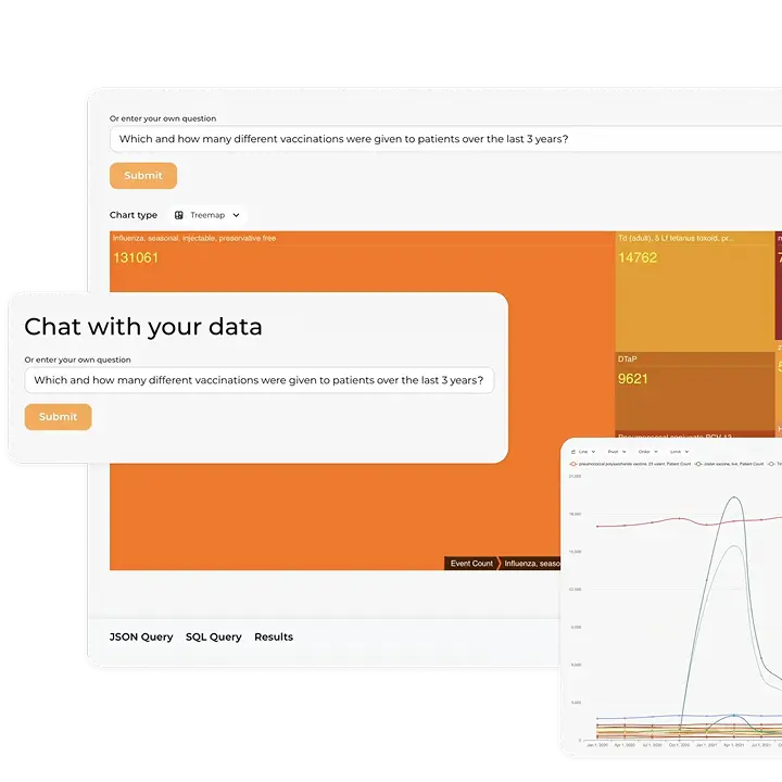
Efficient and meaningful analysis of data lies at the heart of many critical medical studies today. It’s also equally vital for healthcare practitioners like physicians, nurses, and other professionals to navigate health interfaces, generate reports, review patient information, and identify trends.
However, given the vast amounts of data and complex analytical demands, clinical data visualization tools are essential to achieving these goals. Such tools can convert raw data and complex models into actionable insights that improve patient care, facilitate population management, and support advanced research to better understand health outcomes and treatment efficacy.
In this post, we will examine the historical context of using visualization of data in healthcare, give a review of modern health data visualization techniques, and provide healthcare data visualization examples of leveraging visualization to improve health services.
What is data visualization in healthcare?
The practice of visually representing data through graphs and charts dates back to the late 18th century, but in healthcare, one of the earliest examples of using clinical data visualization to generate knowledge was developed by Florence Nightingale in 1858. She used a polar-area diagram, also known as a coxcomb chart, to illustrate the relationship between sanitary conditions and soldiers’ deaths compared to deaths from battlefield wounds.
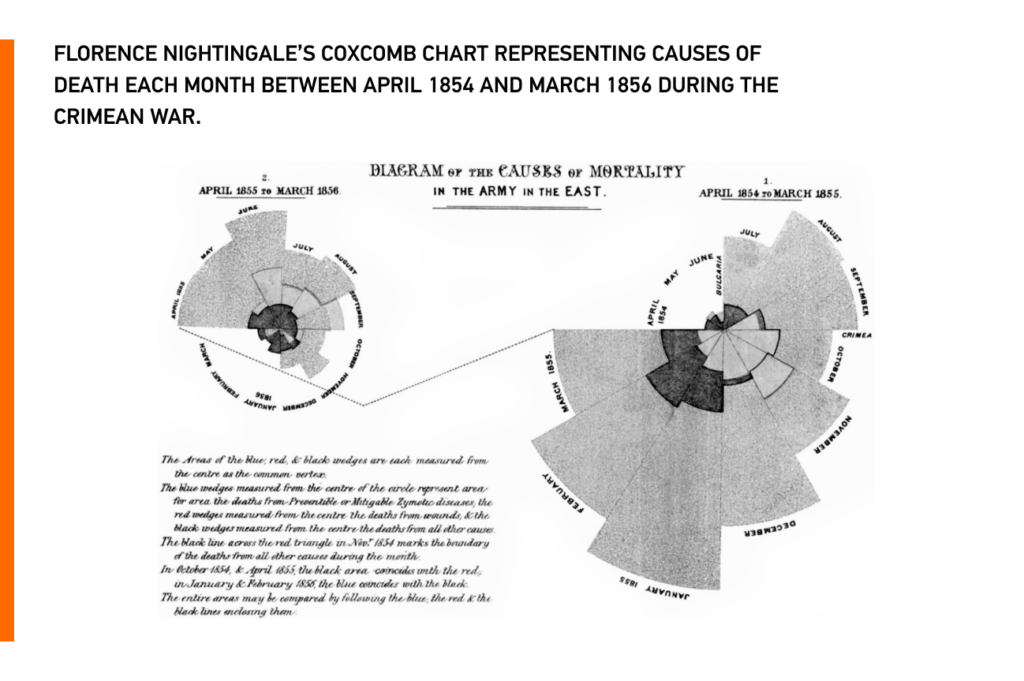
Since then, standardized charts and graphs have been used for specific types of healthcare data to quickly identify the need for appropriate interventions.
For example, graphing vital signs data can quickly detect changes in physiological data, indicating the need for intervention and demonstrating the effectiveness of interventions. Additionally, Fishbone diagrams are commonly used to graphically represent laboratory results.
Various scales, shapes, and colors have been used with small and large datasets to render visual diagrams, such as bar charts, line graphs, scatterplots, and pie charts, revealing patterns that lead to knowledge discovery. Integrating world data for health research into these visualizations can further enhance the depth of insights, enabling more informed decision-making in healthcare.
Data visualization in healthcare services is increasingly used to streamline the analysis of complex datasets, enabling professionals to identify trends, correlations, and actionable insights efficiently.
The most common healthcare data visualization examples
Data visualization in healthcare transforms complex datasets into graphs, charts, or dashboards that highlight patterns and trends. Common examples include patient‑monitoring dashboards, epidemiological heat maps, comparisons of treatment outcomes, and predictive analytics for hospital resource planning. Such visual tools help clinicians see correlations quickly and make data‑driven decisions.
Nowadays, data visualization remains a powerful tool in healthcare that helps healthcare professionals easily understand and interpret large amounts of data, leading to informed clinical decision-making, better patient outcomes, and efficient resource allocation and planning.
Effective healthcare data visualization best practices include choosing the right type of visualization, tailoring it for the audience, using clear labels, and highlighting the most important insights. These practices help explain why is data visualization important for healthcare in improving decisions and outcomes. These best practices ensure data visualizations are not only informative but also engaging and user-friendly.
Types of data visualization in healthcare
To represent healthcare data in a more human-readable form, various types of visualizations can be used, including:
- Charts and different types of medical graphs — like line charts, bar charts, and scatter plots — remain the most common way to communicate health information clearly and efficiently.
- Line charts: Used to show the trend of a variable over time;
- Bar charts: Used to compare different values across categories;
- Scatter plots: Used to show the relationship between two variables;
- Infographics: These are graphical representations of data and information that can engagingly communicate complex data.
- Geographic maps: Maps are used to visualize geographic data, such as disease prevalence or health outcomes, and identify patterns or trends across different regions.
- Dashboards: Real-world healthcare data visualization dashboard examples show how hospitals monitor patient health, treatment outcomes, and operational KPIs on intuitive, interactive screens that support quick, informed decisions.
Importance of data visualization for healthcare
The benefits of data visualization in the medical field are numerous and significant. By implementing and adopting different visualization tools in the healthcare sector, healthcare providers can enhance overall healthcare provision, improve patient care, and detect fraud and errors within healthcare organizations.
What is the main benefit of data visualization?
Visualizing health data saves time and improves understanding. It lets clinicians and administrators identify patterns, outliers, and trends in large datasets and communicate findings clearly. Effective visualization supports evidence‑based decisions, enhances patient education, and helps track outcomes, population health, and compliance efforts.
Data analysis tools such as healthcare data intelligence, machine learning, and artificial intelligence have been particularly helpful in identifying disease trends and patterns among specific populations. This is vital for making informed decisions about healthcare provision and raising awareness about modifying lifestyles for better health outcomes. Below we’ll review some of the benefits data visualizations bring to healthcare and answer the question of how data visualization is used in healthcare.
1. Improvement of overall patient care
Utilizing visualization of healthcare data positively impacts the general provisioning of healthcare, supports healthcare providers in clinical decision-making, and facilitates their ability to predict and react to potential threats.
Visualizing patient health data in real-time is crucial for improving the quality of care and enabling healthcare providers to make necessary clinical decisions based on the patient’s situation.
For example, medical data visualization techniques help in monitoring various healthcare parameters, such as oxygen saturation, which can be analyzed in real-time to evaluate patients’ responses to the treatment provided.
Real-time data visualizations significantly help providers detect abnormal parameters and facilitate the intervention needed to improve patient outcomes and overall healthcare quality in the healthcare facility.
2. Disease trend and pattern recognition
Determining trends in healthcare is vital for making decisions regarding healthcare provision. Identifying and assessing disease patterns among specific populations is crucial for raising awareness about modifying lifestyles and addressing potential health threats.
Data analysis and visual presentation on obesity is a good data visualization example for healthcare with trend and pattern recognition; it acts as an indicator for public and community health. Identifying the factors behind the trends can help raise awareness about modifying the lifestyles of patients as well as the general public.
3. Simplified data presentation
Data presentation for various audiences is another key advantage of healthcare visualization techniques. Healthcare data can be more challenging to interpret among providers working in different disciplines compared to individuals with no medical background.
The primary purpose of using modern clinical data presentation tools is to simplify complex data so it can be easily interpreted by any audience, regardless of their background or medical expertise. Utilizing presentation tools to illustrate disease prevalence and the factors affecting it makes medical data valuable and easily accessible to any intended audience.
4. Accelerated performance
Clinical data visualization accelerates the performance of healthcare providers through several measures, such as ensuring prompt clinical decision-making in critical situations, which positively impacts patient prognosis and health status.
Furthermore, implementing data visualization for hospitals can accelerate performance, reduce care inadequacies, and help build a strong reputation for efficiency and improved patient outcomes.
By incorporating advanced healthcare and medical visualization tools, organizations can further enhance their ability to deliver precise diagnoses and personalized treatment plans.
5. Healthcare fraud visualization and error detection
Implementing various health data analytics and visualization techniques in healthcare enables the detection of frauds and errors that occur within healthcare organizations, for example, those related to medical billing.
According to a report published by Medicare and Medicaid, most of the fraud cases that occur within healthcare facilities are committed by the healthcare providers who work in the healthcare facility. Fraud cases usually cost healthcare facilities losses of 58.5 to 89.3 billion dollars.
The most prevalent forms of billing fraud in healthcare facilities are duplicate billing, phantom billing, false prescriptions, and other types of insurance fraud by healthcare providers.
Clear and proper correlation among stakeholders, including patients, healthcare payers, and providers regarding claims, can enhance the integrity of the billing process and decrease fraudulent schemes.
Implementing data visualization techniques has significantly improved transparency in the healthcare sector, leading to better healthcare outcomes for patients and more efficient and effective healthcare provisions.
Healthcare data visualization tools
There are many reliable data visualization tools in healthcare available today. These tools allow medical professionals to turn complex datasets into meaningful visuals and support better decision-making. Here are some popular examples:
1. Tableau
Tableau is a widely used data visualization tool that offers powerful features for healthcare analytics. It allows users to create interactive dashboards, charts, and maps, making it easier to explore and communicate complex healthcare data.
2. Power BI
Microsoft Power BI is another popular tool used for data visualization in healthcare. It provides interactive dashboards, reports, and data exploration capabilities. Power BI integrates well with other Microsoft products and allows for real-time data monitoring.
3. QlikView
QlikView is a business intelligence and data visualization tool that enables healthcare organizations to analyze and visualize large datasets. It offers a drag-and-drop interface and powerful associative search capabilities, allowing users to explore data intuitively.
4. D3.js
D3.js (Data-Driven Documents) is a JavaScript library for creating dynamic and interactive data visualizations on the web. It provides a high level of customization and is often used by healthcare professionals and researchers to create tailored visualizations.
5. Plotly
Plotly is a data visualization library available in multiple programming languages, including Python, R, and JavaScript. It offers a wide range of chart types and interactive features, making it suitable for creating healthcare visualizations.
These are just a few examples of data visualization tools used in healthcare. The choice of tool often depends on the specific needs and requirements of the healthcare organization or individual users.
Machine learning for healthcare data visualization
Machine learning is the use of algorithms to analyze data and identify patterns that can be used to make predictions and informed decisions. This approach involves training computers to learn from large datasets, so they can recognize patterns and make intelligent suggestions based on that information.
How does machine learning work for healthcare data visualization?
Machine learning for health data visualization involves using advanced algorithms and techniques to analyze and present large and complex healthcare datasets for data visualization in a meaningful and actionable way.
Advanced patient data visualization techniques and machine learning help providers uncover patterns in clinical data, improving diagnosis and personalized care.
A practical example of using machine learning algorithms to visualize data and infer data meaning
To demonstrate how machine learning can be used for data visualization, let’s consider a scenario where a healthcare provider has a large dataset containing patient records and wants to use it to predict heart disease risks in patients. This dataset can contain information such as patient demographics, medical history, lifestyle factors, and lab test results.
We can employ machine learning algorithms to determine patterns that are associated with an increased risk of heart disease. For example, the algorithms may identify that patients over 50 years old with high blood pressure who smoke have a higher risk of developing heart disease.
To visualize this information, the provider can create an interactive dashboard that displays the crucial risk factors for heart disease. The dashboard could contain charts and graphs that show the distribution of risk factors among the patient population. The dashboard might also have interactive filters that allow users to dive deeper into specific subsets of the data.
In addition, the dashboard may include a predictive model that uses machine learning to estimate a patient’s risk of developing heart disease based on their specific risk factors. The model might generate a risk score that can be visualized using a color-coded heatmap or other graphical representation.
By visualizing this data, healthcare providers can quickly identify patients who are at risk for heart disease and develop targeted interventions to reduce their risk. They can also track changes in the patient population over time and assess the effectiveness of interventions in lowering the incidence of heart disease.
Interactive clinical data visualizations to support healthcare
The health community has been slow to adopt the use of data. One of the reasons for this is due to the nature of health data, which is large, complex, and unstructured, and can come from various sources, be generated at different speeds, and can be incomplete or inaccurate. As a result, it can be challenging for users to effectively work with the data.
For large amounts of data and a multitude of questions to investigate, interactive visualizations are the perfect solution. These visualizations allow users to seamlessly navigate from one visualization to another and provide a contextual understanding of the data, making it easy to find answers to specific questions or hypotheses.
Interactive visualizations, designed effectively, can provide a solution for analyzing and exploring large datasets. They can help maintain context during exploration, support the identification of patterns, and enable users to engage in various tasks. Interactive data visualization is therefore an indispensable tool for exploring complex data and drawing meaningful insights from it.
In contrast, non-interactive visualizations may not be suitable for complex datasets and may be better suited for printing and sharing reports via email as static information.
Overall, interactive visualization allows healthcare professionals to explore complex data sets more thoroughly. With interactive tools, healthcare professionals can view data from different perspectives, filter data, and drill down into specific details. By leveraging interactive visualizations, the health community can unlock the potential of health data to improve health outcomes and reduce costs.
How to effectively apply data visualization in healthcare
Choosing the right question to ask
It is important to have a clear understanding of the goal of your research. This step is crucial as it will determine what sort of data is needed, the type of analysis necessary, and the types of medical data visualizations that would be most effective to communicate your explorations or findings.
Choosing the right type of visualization
Different types of data require different types of visualization. For instance, if you want to show a trend over time, a line or bar chart might be more appropriate, whereas if you want to show the relationship between two variables, a scatter plot might be more effective.
Designing for the audience
The visualization should be designed with the intended audience in mind. For example, a dashboard meant for physicians might include different metrics than one for patients.
Using clear and concise labeling
The labels on the visualization should be clear and concise, and they should accurately reflect the data being displayed.
Emphasizing key insights
The visualization should emphasize the key insights that are most relevant to the audience. This can be achieved by using color coding, highlighting certain data points, or adding annotations to the visualization.
Incorporating interactivity and customization
Interactive visualizations allow users to explore the data on their own terms, while customized visualizations can be tailored to the specific needs of the audience.
Healthcare data visualization examples
A tool that provides a real-time display of the anticipated disease progression and response to treatment for children diagnosed with Crohn’s disease.
Crohn’s disease is a chronic inflammatory bowel disease with a high rate of complications that can decrease the quality of life. Despite improvements in understanding and treatment, the risk of complications and the need for surgery remains high. Newer treatments, such as immunomodulators and biologics, have shown promise in achieving clinical remission.
Children with Crohn’s disease can be effectively treated with immunomodulators and biologics. However, a major hurdle in administering these agents is the difficulty in conveying the expected course of the disease with and without treatment to patients and their families.
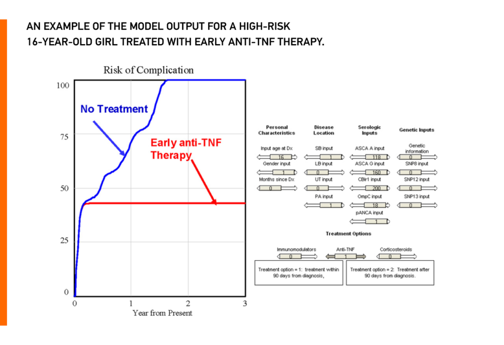
This project leverages system dynamics analysis (SDA) to create a visualization tool that predicts and communicates individualized risks of Crohn’s disease complications and how treatment may modify those risks.
System dynamics analysis (SDA) is a methodology that can provide real-time individualized predictions of outcomes and can create simple graphs to convey predicted outcomes over time.
Using SDA, a model was developed to predict the individualized risk of complicated Crohn’s disease and how this risk is modified by treatment. A graphic display of these results can help providers communicate disease outcomes and treatment options to patients and their families.
Human-centered development of an electronic health record-embedded, interactive information visualization in the emergency department using fast healthcare interoperability resources.
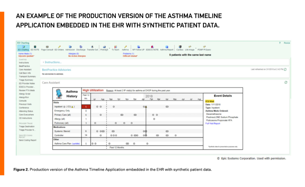
The development of electronic health records (EHRs) has revolutionized healthcare, but their usability and impact on clinician burnout have become major concerns. The authors of this study applied human-centered design (HCD) principles to develop an Asthma Timeline Application that incorporated modern health data standards such as FHIR® (Fast Healthcare Interoperability Resources).
FHIR® is a standard for exchanging healthcare information electronically, which enables different healthcare systems to exchange data seamlessly. The use of FHIR® in the application allowed for the integration of data from the EHR (Electronic Health Record) system, which is typically siloed and challenging to use.
The FHIR®-based web services made it possible to implement the Asthma Timeline Application across organizations, beyond the single institution where the study was conducted. The study also highlights the potential benefit of using FHIR® to enable sharing applications across different EHR platforms without requiring vendor-specific code.
Usability testing of the Asthma Timeline Application demonstrated a significant reduction in time on task and cognitive load for clinicians compared to base EHR functionality, as well as an increase in information retrieval accuracy of specific asthma-related data points.
A post-implementation survey also showed positive feedback for the visualization, which could potentially aid in identifying issues and providing a snapshot of the patient’s asthma history.
Conclusion
The influx of data in the health field poses significant challenges to users who interact with it, ranging from cognitive overload to difficulties in interpreting the data accurately. To harness the full potential of health data, there is a critical need for sophisticated visualization tools that can support users as they engage in multifaceted tasks.
As the health sector continues to evolve, the use of data visualization will play a pivotal role in supporting effective decision-making and enhancing overall patient outcomes. Additionally, converting health data to UCUM format can help to improve the accuracy and efficiency of data analysis and visualization, leading to better decision-making and improved patient outcomes.
Explore how the benefits of data visualization in healthcare tackle cognitive overload and interpretation challenges, unlocking health data’s full potential.
Looking to unlock the full potential of your healthcare data through interactive visualizations? Our team has hands-on experience building intelligent healthcare analytics solutions that support interactive visualizations and transform complex datasets into actionable insights. What’s more, our Kodjin FHIR® server can serve as a scalable smart storage tool for all your data needs, so your data will be structured, organized, fast to retrieve, and accurate.
With Kodjin, you can seamlessly access, integrate, and visualize your healthcare data to improve patient care, enable more effective population management, and support advanced research. Contact us today to learn more and schedule a demo.


